In an era saturated with digital noise and visual clutter, minimalism continues its reign as a dominant aesthetic, especially in tools designed for organization and productivity. For the 2025 calendar year, minimalist design is evolving, moving beyond simple austerity to incorporate subtle textures, intentional typography, and enhanced functionality. This ultimate guide explores the key minimalist calendar design trends set to define 2025, offering insights for designers, productivity enthusiasts, and brands looking to refine their visual identity.
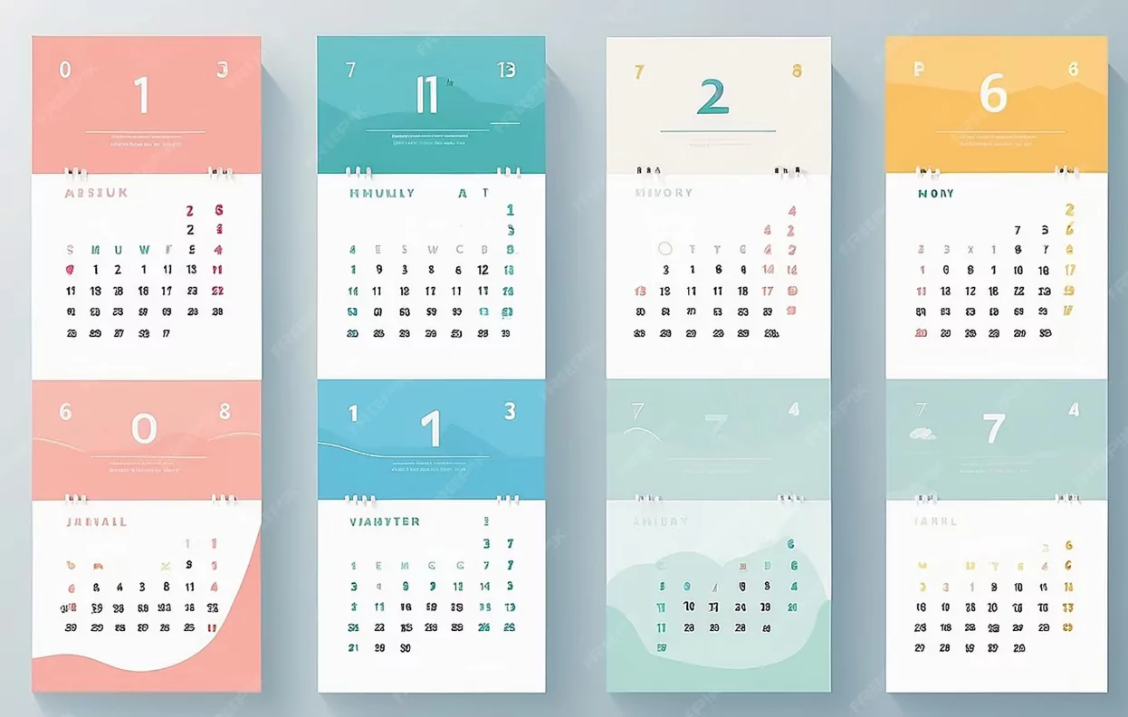
Trend 1: The Rise of Monochromatic Muting (Less White, More Tone)
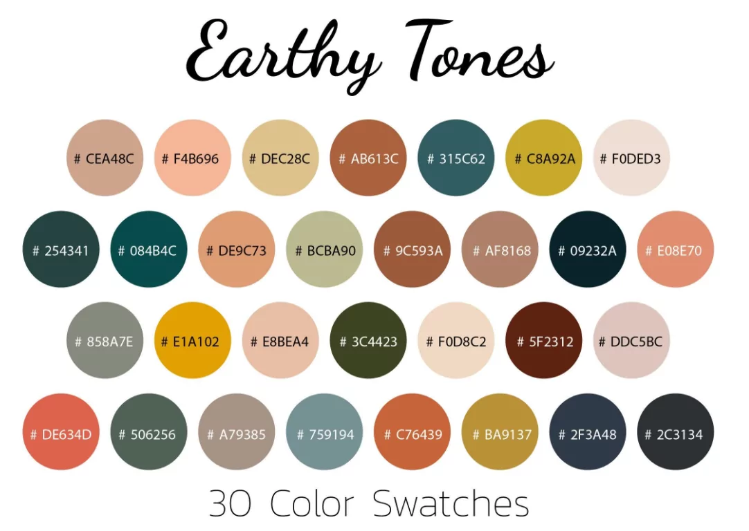
While the classic minimalist palette relies on high-contrast black and stark white, the trend for 2025 shifts toward a warmer, softer monochromatic approach. Designers are opting for muted, earthy tones that are easier on the eyes, particularly for digital displays and all-day use.
- Earthy Neutrals: Expect to see more calendars using soft off-whites, cream, and gentle beige as backgrounds, paired with charcoal gray or deep taupe for text. This approach maintains high readability while reducing screen fatigue.
- The “Greige” Focus: The blend of gray and beige (greige) offers a sophisticated, calming base. When used for subtle shading or separators, it allows the actual content (dates and events) to pop without relying on harsh color breaks.
- Strategic Pops of Color: Color is not eliminated, but used with **surgical precision**. A single, bold accent color (e.g., deep terracotta or muted sage) is reserved exclusively for high-priority items, deadlines, or the current day, adhering to the principle of “color as function.”
Trend 2: Intentional Typography and Negative Space
Typography becomes the primary decorative element in true minimalist design. In 2025, the focus is on maximizing the impact of letters and numbers through size and placement, emphasizing **negative space** as a structural tool.
Typographic Hierarchy
Designers are using fewer font families but maximizing contrast through weight and size. A clean, highly legible **sans-serif font** (e.g., Helvetica Neue or a contemporary geometric sans) is used for the main body, while the year and month headings might use an unexpectedly heavy bold or a subtle serif for textural contrast.
Asymmetrical Grids
Traditional symmetrical grids are being challenged by **asymmetrical layouts**. Days of the week might be positioned far to the left, leaving a vast amount of empty space on the right, which acts as a visual resting spot and functional area for quick notes. This deliberate imbalance feels modern and dynamic, despite the lack of ornamentation.
Trend 3: Functional Minimalism (The Digital-Physical Crossover)
The best minimalist designs blur the line between physical desk calendars and digital interfaces, focusing on utility and seamless interaction. The goal is to make the calendar an elegant system, not just a static display.
- Widget-Ready Layouts: Physical calendar layouts are increasingly mimicking digital widgets—clean, contained blocks with high information density but minimal chrome. This makes them easy to integrate into digital dashboards or printed planner systems.
- Modular and Customizable: The trend favors modular designs where sections can be easily detached or rearranged. For instance, separate weekly and monthly views that can be interchanged, allowing the user to curate their own information density based on their current focus.
- The “Invisible UI”: In digital calendars, the focus is on the “invisible user interface.” Features like natural language input (typing “meeting tomorrow at 3pm”) and automatically color-coded events based on keywords minimize the need for manual navigation and button clicks.
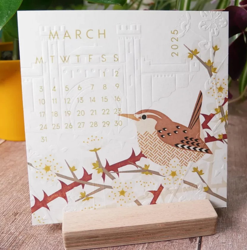
Trend 4: Textured Simplicity (Focus on Materiality)
For paper and physical calendars, minimalism in 2025 is expressed through the tactile experience. The material itself becomes the core design statement.
- Embossing and Debossing: Instead of heavy ink or graphic elements, calendar dates or monograms might be subtly **embossed** (raised) or **debossed** (impressed). This texture adds sophistication and depth without adding visual noise, emphasizing high-quality craftsmanship.
- Recycled Paper Stock: There is a growing preference for natural, slightly fibrous, or recycled paper stocks. The visible texture and inherent sustainability message enhance the minimalist aesthetic, which often champions conscious consumption and timelessness.
- Wabi-Sabi Influence: The Japanese concept of Wabi-Sabi (finding beauty in imperfection) is evident, favoring raw edges, deliberate simplicity, and materials that show their age gracefully, moving away from the harsh, manufactured perfection of earlier digital-age minimalism.
Conclusion: Minimalism as Enhanced Function
The minimalist calendar design trends for 2025 confirm that simplicity is not the absence of something, but the perfection of focus. By prioritizing muted tones, highly legible typography, modular utility, and tactile materials, designers are creating tools that reduce cognitive load and enhance productivity.
Whether you are designing a sleek digital app interface or a premium printed desk calendar, embracing these trends ensures your organizational tool is not just aesthetically pleasing but is actively contributing to the user’s clarity and efficiency.


