A 2026 wall calendar can do double duty: it helps you plan clearly and it upgrades your space like a piece of wall art. This guide covers home and office ideas, style directions, sizing, materials, and easy ways to make a calendar look intentional in your decor.

How to Choose the Right Wall Calendar
Start with your main purpose: planning-heavy, decor-first, or a balanced mix. The best pick is the one you can read quickly, write on comfortably, and keep on the wall all year.
- Readability: Clean typography, strong contrast, uncluttered grid.
- Writing space: Big enough date boxes for your actual schedule.
- Style match: Colors and artwork that fit your room’s palette.
- Placement: Consider lighting (glare) and viewing distance.
2026 Wall Calendar Ideas for Home
Kitchen “Command Center” Calendar
For busy households, pick a large monthly grid with generous squares. Add a notes area nearby (or choose a calendar with a built-in sidebar) to keep daily details from cluttering the dates.
- Large grid with a short “This Week” or “Top Priorities” section.
- Matte finish to reduce glare under strong lights.
- Soft neutrals or warm tones for a cozy look.
Living Room Calendar as Wall Art
Make the calendar feel like decor by choosing artwork-led pages with a consistent color story. A minimal grid keeps the visuals calm and helps it blend into a gallery wall.
- Full-bleed photography or illustrations with a small, tidy grid.
- Poster-hanger or frame-friendly format for a finished look.
- Seasonal palettes that complement your textiles and art.
Entryway / Mudroom Family Organizer
In an entryway, speed matters. Bold dates and a simple layout help everyone scan the month in seconds before heading out.
- High-contrast dates and clear month labels.
- Color-coding for family members or categories (work, school, bills).
- A small notes area for reminders and errands.
Bedroom or Reading Nook (Calm Minimalist)
Keep it quiet visually: fewer lines, softer imagery, and more whitespace. Smaller sizes can feel more intentional in restful spaces.
- Minimal grid with subtle lines and muted tones.
- Botanical, nature, or abstract artwork for a soothing vibe.
- Compact size to avoid dominating the wall.
2026 Wall Calendar Ideas for Office
Minimalist Home Office Setup
A modern workspace looks best with crisp typography and a simple grid. Use one accent color for deadlines to stay organized without visual clutter.
- Monochrome or neutral palette with one highlight color.
- Monthly goals box or a slim notes column.
- Thicker paper to handle frequent writing.
Creative Studio / Team Planning Wall
For collaborative planning, prioritize visibility and structure. A clean layout with space for milestones makes it easier to align projects at a glance.
- Large size for readability from a distance.
- Simple legend for project categories.
- Room for launch dates, reviews, and key deliverables.
Reception or Client-Facing Space
Choose a timeless design that feels polished and professional. Neutral art and premium finishes help the calendar blend with modern office decor.
- Elegant, consistent typography and spacing.
- Matte paper or anti-glare finish.
- Refined visuals that don’t overwhelm the room.
Popular Styles for 2026
- Modern minimalist: Clean grid, neutral colors, lots of whitespace.
- Scandi-inspired: Soft tones, airy layout, gentle textures.
- Botanical: Plants and florals that add calm to any room.
- Abstract color blocks: Contemporary look with strong design energy.
- Travel/landscape: A “mini art print” vibe every month.
- Vintage: Retro illustrations with muted palettes.
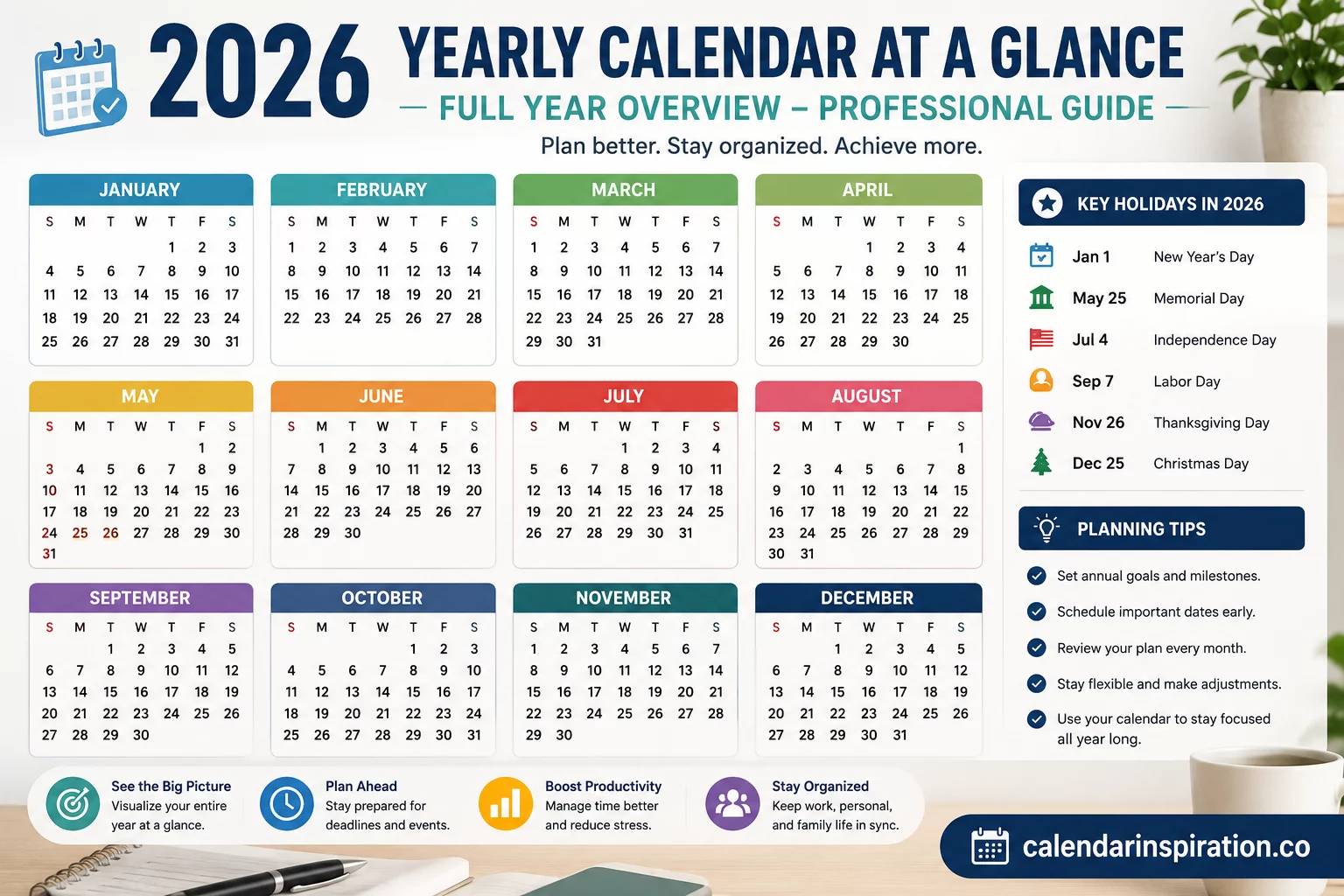
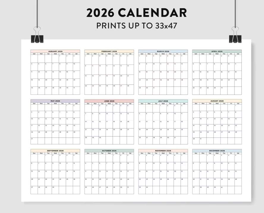
Size and Layout Guide
Choose size based on how far away you’ll read it and how much you write. If your schedule is dense, prioritize a larger grid; if the calendar is mainly decor, you can go smaller with stronger visuals.
| Best For | Suggested Format | Why It Works |
|---|---|---|
| Daily planning (home office) | Medium monthly grid + notes | Easy to read at desk distance, enough writing space |
| Family scheduling (kitchen/entry) | Large grid (high visibility) | Everyone can see and write clearly |
| Small wall space | Vertical layout (slim width) | Fits narrow areas without looking crowded |
| Team planning | Large grid (shared viewing) | Readable from across the room, supports collaboration |
Make It Look Like Real Decor
A wall calendar looks intentional when it matches nearby elements and has a “finished” mounting style. Keep it cohesive by repeating one detail: frame color, paper tone, or a single accent color.
- Use a frame or wooden poster hanger for a clean gallery feel.
- Match one calendar color with a nearby object (book, vase, lamp).
- Write with one dark neutral pen and one accent color for highlights.
- Hang it where it’s easy to write on, not too high.
FAQ
Sunday-start or Monday-start?
Choose the one that matches your routine and keep it consistent across your planners and digital calendars to reduce mistakes.
What’s the best option for a busy schedule?
A large monthly grid with a small notes column is the most versatile. Add simple color-coding to track categories without clutter.
How do I prevent it from looking messy?
Use short labels, avoid long to-do lists in date boxes, and keep detailed tasks on a separate list while the calendar holds key dates.